
You’re busy, but you need to keep up with your finances. Here’s how QuickBooks can fill you in – quickly.
QuickBooks is very good at recording and storing details. You can find minutia of all kinds, like customer ZIP codes and one-time discounts, and reorder points for inventory. But it’s equally skilled at providing views of the big picture. And it offers numerous ways to get there.
You can, for example:
- Customize and run preformatted Reports.
- Consult the Income Tracker and Bill Tracker.
- Open the Customer Center and Vendor Center.
These pages can be helpful in a variety of situations. But it takes time to zero in on the specific details you’re looking for. When you just want a series of broad overviews of how various elements of your finances are doing, and you want them fast, there are two QuickBooks pages we recommend: Insights and Snapshots.
What Is the Insights Page?
When you launch QuickBooks, it may or may not open to the software’s home page. If it doesn’t, click Home in the toolbar. You’ll see two tabs in the upper left. Click the second one labeled Insights.
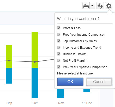
You can customize the QuickBooks Insights page to see the charts and graphs you want.
Before you start looking at the charts and graphs that are available on this page, look in the upper right corner to see what your options are here. You’ll see whether your business runs on a Cash or Accrual Basis, for one thing. You would have specified this during setup. If you’re not sure why you’re one or the other and want to make sure you made the correct choice, contact us, and we’ll go over the differences as well as answer any other questions you might have about the “bones” of your QuickBooks installation.
Click the down arrow next to the printer icon if you want to Print or Save As PDF. You’ll click the opposing arrows if you want to Refresh the page. And clicking the gear icon opens the list of available charts and graphs. Keep in mind that if you choose several, they won’t all appear on the page at the same time. There’s an arrow at the right edge of the screen that will allow you to scroll to the others.
What Can You Learn From the Insights Page?
Once you’ve decided which charts and graphs to view (and you can always change this, of course), you can explore the customization options each offers. This is primarily just the date range. Here are the visuals you’ll see:
- Profit & Loss tells you whether you made or lost money during a specific period.
- Income uses colored bars to show you the dollar value of unpaid and overdue invoices, as well as those paid in the last 30 days.
- Expenses divides your expenses into categories.
- Prior Year Income Comparison allows you to compare your current income to that of previous years by date range.
- Top Customers by Sales tells you who your best customers are based on the amount they purchase.
- Income and Expense Trend compares your income and expenses by month.
- Business Growth looks at this fiscal year and the last in terms of total income.
Before you start rearranging your Insights page, think about the kind of information you’d like to have available quickly. Where are you having the most trouble with your business? You may not even have to display all of the charts and graphs. For example, are you running into problems with late invoice payments? Make sure the Income page is active. There are QuickBooks tools that can help you encourage your customers to pay faster, like sales form customization and QuickBooks Payments. Let us know if you want to schedule a session to go over some of these.
How Can You Use Snapshots in Your Accounting Work?
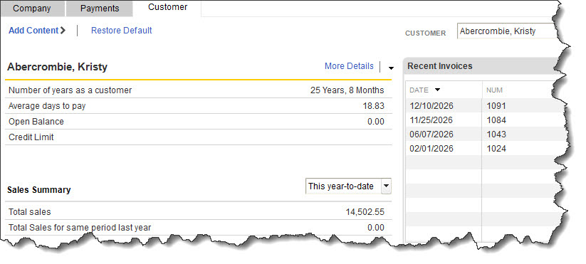
You can learn a lot about your Company, Payments, and Customers from QuickBooks’ Snapshots.
You can find QuickBooks’ Snapshots by clicking a link in the toolbar. You’ll notice that there’s some duplication between Insights and Snapshots. But the Snapshots pages contain a lot more information, most of which is in data tables rather than charts and graphs. This tool is divided into three different pages that are accessible by clicking their tabs. The three types are:
Company. This is the page where you’ll see some of the same charts and graphs you saw on the Insights page. But you’ll also see windows that provide real-time data on Customers Who Owe Money and Account Balances.
Payments. This is an important page for business owners who want to keep a close watch on their accounts receivable (AIR). You can view tables and charts that cover content like:
- Recent Transactions.
- AIR By Aging Period, a graph that displays past due payments divided by date range (Current, 1-30, 31-60, 61-90, and greater than 90 days).
- Payment Reminders.
- Invoice Payment Status.
- Receivables Reports.
Customer. How well do you know your individual customers? You’ll get a much deeper view of them by browsing these pages. You can consult graphs and tables about each one that detail Recent Invoices and Payments, Sales History, and Best-Selling Items.
Use What You Learn
We know how busy you are. You probably already have a lot to take care of when you open QuickBooks. But we think it’s critical for you to take a few minutes to consider the big picture a couple of times a week while you’re doing other work in QuickBooks. You’ll learn things sometimes that will lead to action, but other times, you might be pleasantly surprised to see how well things are going. As always, we’re here to answer questions you have about QuickBooks and how it can best serve your business.